
“You know a good design when you see it.” I’ve heard this many times from different people, and I cannot but agree. Great design is what happens when you just enjoy using a product, when you don’t feel frustrated, when you feel that you’re the best person in the world. That’s when you know there’s good design involved.
But we have to be careful here. Design has been so solely focused on art works that sometimes good design is almost synonymous with being able to use Illustrator or Photoshop like a pro. However, nowadays, the definition of design does not merely include artworks, but also includes other things, like products, services, branding, among others.
So with this in mind, here’s my list of 5 Examples of Good Design, and along with that, 5 Examples of Bad Design. To make it fair and interesting, I have selected one example of good design and one example of bad design from the same general category. So for example, I have chosen to compare two websites.
Websites
Bad Design

NYU New York Student Portal
The NYU Home webpage is just not very nicely designed for a couple of reasons. When first welcomed into the home page, I get a mixed hodgepodge of Lists, Help, FAQs, ITS, World Trade Resource and Global Services resources. Already, I am confused as to what this website it up to. Now, when I try to navigate the website, I hover over the general categories, hoping for something to tell me what’s in each of the navigational tabs. And yet, I get nothing. And just to make things worse, there’s isn’t even a search functionality built into the platform. It is just frustrating to use.
Good Design

NYU Abu Dhabi Student Portal
The NYU Abu Dhabi Student Portal page is very nicely designed. Things are where they are supposed to be. Things most important–such as announcements–are clearly placed in a central real estate in the web page. Events are also easily accessible (not like the NYU New York website where I have to first go to News [Who would have thought Events is under News]), and a bookmarks menu available. When I hover over each of the navigational tabs, I also get to see all the possible options, so I don’t need to click all three to figure out where everything is. If I can’t find anything, search is just a click away.

Packaging
Bad Design
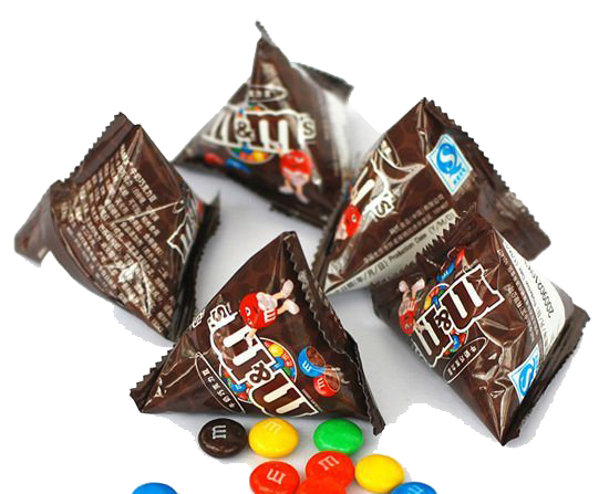
Triangular M&M Packaging
As a kid, I’ve always found it difficult to eat these M&Ms in this kind of packaging. There were many times I spilled all of my M&Ms on the ground because the bag of M&Ms just tilted over. I also was always confused where it was best to open the bag. Was it like opening a bag of chips where I had to pull from side to side? Or should I just tear it? But if I tear it, my fingers won’t fit through the hole to get my M&Ms! This is self-explanatory.
Good Design

Smints
Smints are just the coolest thing on Earth. When you first figure out how to use it, you are just amazed by how such a cool release of mints could just be made by some simple thing. In fact, when I first had it, it was almost second nature for to try to press the white portion down. the fact that it was a triangle, it was white, and it was springy, already alerted me to how the candy was to come out! It also allowed for the mints to be stored without being contaminated. And plus, it also controls my intake! This amalgamation of being easy to use, and easy to discover how to use, along with its ability to store the mints nicely makes it great design.
Signs
Bad Design
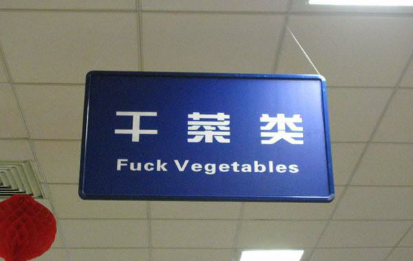
Signs Lost in Translation
How much does it take to ask an English speaker to check your translations? While it is quite amusing at first, signs are meant to guide people to the proper aisles or sections of supermarkets, and a sign like this, especially if you don’t speak Mandarin, won’t help!
Good Design
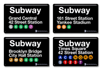
New York Subway Signs
New York’s subway signs are amazing. They feature a clean font that is easily read on a great black and white contrast. The color-coding of the different lines also makes it easy for passengers to figure out and remember where they are headed to, and similar lines that they might take. It’s also very uniform, so it makes it very easily recognizable even from a distance. As a result, it’s really good design, and also with really good typography.
Ads
Good Design
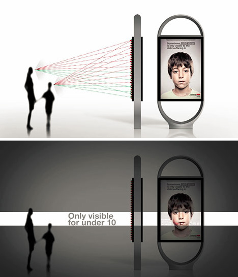
Anar Foundation Anti-Abuse Message
This really innovative ad was designed really well because it was able accomplish it’s goal of reaching out to separate audiences at the same time through two different viewing angles. In this case, one was for the parent, and the other for the child, with a help number in tow. Here’s a cool video explaining how it’s done. It’s great design because it was able to accomplish its goal of segmenting discoverability to its different audiences. Amazing!
Bad Design
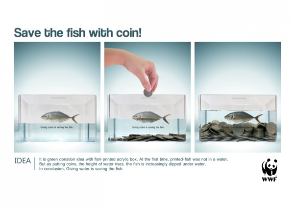
WWF Ad
I don’t think I can even explain what’s happening in this ad. Not only is the explanation impossible to understand, the font is also incredibly hard to read from a distance.
Campaigns
Bad Design
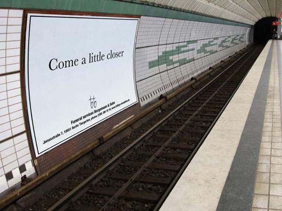
Metro Funeral Services Ad
Well, let’s just say you shouldn’t.
Good Design

Dumb Ways to Die
Dumb Ways to Die is an app created by the Australian Metro Agency that involves an mobile apps, theme songs, posters, etc, to encourage people to be safe around trains. They use cartoon characters and games to get people to understand the importance of being careful around trains. This is great design because when I first heard of the game, I didn’t even necessarily know that it had a hidden message. But see, when I did, I remember the message very well. Plus, it comes with a super catchy theme song!
So here’s my list of 5 examples of good design and 5 examples of bad design! Of course, these are just merely a sample. There are still tons of other examples out there to draw inspiration from or to run away from!


 Lilikha